Friday, 21 November 2014

Audience Research


Audience Research
 
 
Research of E4s demographic.
E4 promote the use of advertisements on their channel and give information into their demographic and the kind of audience that they get, I researched this due to my breif being of a similar demographic. Here’s what they said;
“Why advertise on E4?
 
•E4 and E4 +1's Share of Commercial Impacts holds steady very strong for 16-34s. Furthermore within its competitive set E4 is the top converting channel for Adults 16-34, Women 16-34 and ABC1 16-34s.
•Through research, we know that E4 viewers are predominantly young and upmarket, but they’re also fashion conscious, sociable, connected, heavy internet users, they love going out and tend to use advertising as one of their many information sources. They are also likely to be opinion formers and more likely to talk about brands and convince them to try them out.
•E4 and E4+1 reach over 8.9m people each month. On top of this it has a young and upmarket viewing profile, with; 52% of viewers 16-34 (Vs 23% Total Commercial TV), 43% ABC1 (Vs 38% Total Com) and 61% female (Vs 54% Total Com TV). “
(Information found from; https://www.channel4sales.com/platforms/e4 )
E4 is also available on; Freeview, DSAT and cable, and E4 HD on Sky which give them a wide audience.
Based on what they say in their advertisements page the channel is popular and has a stable audience for 16-34 year olds (only slightly out of my target audience of 15-35). The research also stated that the majority of viewers are ‘young and upmarket, but they’re also fashion conscious, sociable, connected, heavy internet users, they love going out and tend to use advertising as one of their many information sources’- this is ideal for companies wishing to advertise on the E4 channel.
Stats broken down;
E4 AND E4+1 have an audience of over 8.9m people each month.
52% of viewers are 16-34.
43% in the class ABC1 (upper middle class, middle class and lower middle class)
61% Female.
 
It seems that just over half their audience is 16-34 year olds and the majority of viewers are females.
TV shows shown on E4
7 OF THE TOP 10 converting programmes for 16-34 year olds are on E4.
They are;
2- How I met your mother
3- Brooklyn nine nine
4-My mad fat diary
5-Two broke girls
6-The inbetweeners
7-Troy
 
(Info found on E4s Quarterly update PowerPoint)

Sunday, 16 November 2014

Magazine Project

Magazine project (cover, double page and single page) that I worked on with Rabia Ahmed (http://rabiaahmed1997.blogspot.co.uk/)


Thursday, 6 November 2014

Existing Logo research.


Due to my chosen brief being Silver Lining Productions - a TV company- I looked at TV company logos that already exist to give me inspiration and an understanding of why/how the logos are recognisable and represent the company they come from. Due to me not having a theme idea for my main pieces yet I tried to find/analyse logos belonging to channels that have a variation of genres instead of focusing on 3 drama channels for example. Some logos may relate to the genre of the channel however I plan to create a neutral logo that could represent any genre that I plan to base my work around.


Comedy Central


The comedy central logo is quite recognisable mainly due to the logo having the channels name on it, even known the 'central' is upside down its still fairly readable and clear due to the font and colouring. Usually when the logo is on TV at the corner of the screen it has a transparent background so it doesn't cover the picture, also when the logo is advertised on the channel it flips around a bit so you can read the 'central' part, also by having the 'central' upside down it hints at the comedic genre that the channel is.
In the photos I included two variations of the same logo, no.1 is usually in the corner of the screen when a programme is on and no. 2 appears in the adverts like I mentioned.
The colouring of these 2 are black on a white or a transparent background however the channel also features red and white themes, I like how the logo colours are simple and the logo its basic lines as its not over complicated and there's not too much going on. Therefore it is easily recognisable from the forward and backward c's as well as the clear text.


BBC 3
                                         

The BBC3 logo is also fairly recognisable, especially in the UK as it is part of the BBC network. Also like the comedy central logo, the BBC3 logo has text stating it is for the BBC3 making it clear for people to understand and recognise.
This is the current BBC3 logo and it often is a moving image product coming on in adverts for the channel, however the stationary logo again has a fairly simple colour pallet except on the image ( which is one variation of the logo) has different tones of pink as this particular variation is a moving clip that shows the 'three' being filled up with pink liquid.
This logo overall is simple and  clearly presents the company's channel  name. The background of this logo often depends on the adverts background or that of the variation as the BBC3 logo roughly stays the same however can change slightly due to how it's presented/advertised.
 I also like how this advert is fairly neutral as the BBC3 channel shows arrange of genres from soaps to dramas and comedies, this logo doesn't tie them to one thing.


E4


My chosen brief said that the target audience is similar to that of E4 so I decided it would be a good idea to review and research their logo.
The E4 logo again is quite simple, in colour and style, nether the less it is still a recognisable logo despite not knowing what the 'E' stands for (after research I found it stood for entertainment). This company has always been shorted down, like the BBC it uses an acronym to present the company's name.
Similar to BBC3 the channel isn't tied to a specific genre of shows playing host to both dram and comedy, this logo is also fairly neutral and doesn't reduce the variety of shows played into one category like the comedy central one - hints at comedy.
The colour pallet Is also simple and quite plain with only purple and white being used. this can make the logo stand out as its not dark and isn't cluttered with colour.


Overall
 
After reviewing existing TV company logos I have decided I'd like to stick with simple themes/colours and possibly have an acronym to shorten the long 'Silver Lining Productions' title into something quicker to say and something that would fit better as a logo. Also by shortening the logo it is easier to remember and therefore it would be more recognisable to the audience. Also taking inspiration from BBC3 and E4 id like to create a neutral logo (like mentioned before) that won't pin the company to one genre or theme.


Monday, 3 November 2014

Chosen breif.

Silver Lining Productions.
 
 
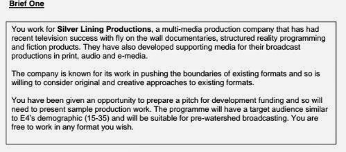
Out of the available briefs I chose brief no.1, this was the Silver Lining Productions brief. This brief states that I work for a multi-media production company, Silver Lining Productions, this company produces; fly on the wall documentaries (such as 'Life behind bars'), structured reality programs (such as 'Made in Chelsea') and fiction products (such as 'Eastenders'). This company also dabbles in supporting media for these broadcasts in print, audio and e-media.
 
The main details included in the brief that can affect my overall project are; a target audience of 15-35 year olds (similar to E4s demographic), my work has to be suitable for a pre-watershed broadcasting and that the company are known for 'pushing the boundaries' of existing formats, which means creative and original approaches are widely excepted.
 
Out of the three possible task choices of Broadcasting, printing and e-media, I decided to chose broadcasting and printing as I think they would be best suited together as printing can be gathered while the film clips are being produced. Going more in-depth into the choice of broadcasting there were three further tasks to choose one from and I an undecided at this current moment over which one to pick however it will most likely be to produce a few opening scenes i.e. opening credits or a two minute moving image product ideal for marketing i.e. a short advertisement. Also going more in-depth into the printing choice there are two further tasks to choose from and I have decided to complete the first one which is to create a teaser ad campaign that will be published before broadcasting the show.